Abigail Scheidler
December 2025 - Present
Packaging Design
Just me!
A collection of my packaging design experience and past projects! I started expressing an interest in packaging design during my senior year as a UX designer. I designed my own independent study where I could practice and research packaging design. I was also contracted to create wine labels for a family friend!
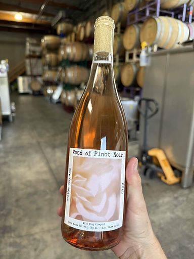
Wine Labels
This was my first ever experience in packaging design!
I was contracted to design three wine labels and the back labels. This was a family friend who was starting her own wine company. She wanted to use my mother's photos predominantly on the label, and my mother, knowing I had an interest in packaging design, recommended me.
The client wanted...
-
Modern
-
Fresh/Cool
-
Not too Dainty
-
not too classic
-
Eye catching
Other labels she liked....


First Pass!
This was the first time I had ever designed any actual packaging! So I started testing some designs in Figma to see if I could mix some of the ideas the client presented. I didn't have the official photos yet, so I used a temporary asset.

Feedback
Reflection
- This doesn't look like a label
- Not enough emphasis on the art
- Looks too Digital
- Cropping of the actual photos is going to be different
It was pretty clear this was my first attempt because I had no idea how to make something that looked like a label. I made these in about 30 minutes, so they really weren't polished or thought-out.
SEcond Pass!
Okay, let's try that again. This time, I had more time to look over the client's direction. I also had the actual photos, so I could crop the picture accurately.

Feedback
Reflection
- FONT WAY TOO SMALL!!!
- This isn't the proper proportions for a wine label.
- Nice to see the art front and center.
- The background color is nice.
The actual style was getting closer to what the client actually wanted, but it was still far off from being effective packaging. I assumed that the label would wrap around the bottle, but it still wasn't right.
Third Pass!
I'm starting to hone in on the vision, so let's try a more serious attempt with all the correct information and images. I tested different crops of the two other labels with the client and ended up with something they were pretty happy with.

Feedback
Reflection
- Love the layout
-The accent mark is over the wrong letter on Rose
- Oops! We didn't get the rights to that font.
With the vision much more solid, I was able to create labels with the actual measurements. Overall, the style was approved! Now it was just polishing. I'm close to done, right?
Logo?
The client also asked if it would be possible to design a logo alongside the wine labels. She said she loved bees, but otherwise, she wanted to see a couple of different ideas.

My grandma drew the bee. (I know my family is so talented.) I was also using a new font. I wanted the bee to be the focus because it represented the client's brand and identity. The bee was already pretty visually complex, so I didn't want to add too much to it. In the end, the client really liked the simple one in the middle. So I iterated on that one.

Here's the finished product! :)
forth Pass
Okay, we need a different font now, no problem! I tested different fonts and eventually found one that the client liked. Great! + Now I have the back design with the logo!


Feedback
- Love it!
- Oh hey the printer needs the vector files.

Reflection
Whew! Now all that was left was to figure out how to export a vector file from Figma! That was going to be easy, right?
Oh man how do files?
As I said, this was my first experience doing packaging design ever. So I made a couple of mistakes at the very beginning that totally came back around at the end.
1. I started working in Figma. Figma is a fantastic program, but it is not made for producing high-quality vector files that printers need. So I ended up remaking the designs in Affinity.
2. I started working in Affinity. Once again, Affinity is a fantastic program and a really good alternative to Adobe Illustrator. I was already learning Affinity, and it was free, so it seemed like a good idea. However, the printer wasn't used to Affinity files, so they weren't sure if there would be problems. So I ended up remaking the design in Illustrator after all.
These delays were unfortunate, but now I know to ask about those kinds of things beforehand. I also didn't get exact measurements for the label until way later because the client was also new to this. However, we figured it out in the end!
Reflection:
We made it! This was a really cool experience to have because my labels really did end up getting printed. I definitely feel like I learned a lot. Asking questions and gathering information is so vital for the process to go smoothly. I'm often tempted to leap into the creative aspect of things, which is fine for concepting, but when it comes to the final product, you really need to know what the client is looking for.
Tech Product Exercise
Okay, so I have a little bit of experience now. Let's try this again.
As a senior at DigiPen Institute of Technology, I decided to create my own independent study class on packaging design. The class would include writing "industry diaries" each week, in which I would examine a different industry and how it approaches packaging. I would also turn in two fully fleshed out projects where I would pick an industry to design for. For my first project, I decided on tech!
Research!
First, I did research on products in the tech-y world. I wanted to see what the patterns were in the packaging and if there were any methods I should keep in mind for my own design.
There were a couple of things I noticed. Color palettes are pretty small, with one primary color that is used throughout most of the packaging. Having a high-quality picture of the product is also important for any product that will be on a shelf. Looking simple, clean, and neat gives credibility as well as a sense of the product being high quality.

I sketched out an idea with a sliding box. The product would be a writing tablet the size of a portable notebook. It was also leaning into the idea of having an eye-catching color while still being clean and simple.
Making it!
I was now way more experienced with Affinity, so I decided to use the program to design the packaging. I also found a simpler die-cut template online so I could potentially print and fold a prototype on my own!


Professional
Ver.
- Simple and Clean look
- Bright yellow stands out
- Clean grays and whites
- Modern-y
- Professional
I made a version with "professional" as the target. However, I wanted to see if I could come up with a different version to compare it against.
Casual/Artsy
Ver.
- More shades of colors
- More complex/less clean
- Different brand
- Casual/Louder


Working in Affinity
This was my first time working with a die-cut template! It was a bit odd to get an idea of scale/direction, but luckily, this template wasn't too complex.


Results
I started asking several different people their opinions on each design. I started by showing the professional one and explaining the product, then showed the casual one.
Professional
Casual/Artsy
- Definitely a tech product
- More High Quality
- Somewhat friendly
- No Nonsense
- Productive
- Corporate/Empty
- Personality
- Old book shop Vibes
- Interesting
- Too Crowded
- "overachieving"
- looked more like a joke
VS
Winner: Professional
Presentation
So! For my independent study, I had to present my design, along with my research, my goals, my inspiration, and some persona data. You can check out the slides here!
Redesign
Lastly, I wanted to take another crack at combining the two designs. So I came up with a design that was meant to preserve the clean, simple look that gave the product credibility, and give some personality to the brand that made it more personable.


Front
Back
Reflection:
This project was a bit challenging because I was designing it for a made-up product. I also didn't have access to higher-quality printing materials that would more clearly show how the colors would look in real life. Overall, I think I learned a lot from this project, specifically about how people react to packaging depending on the price of the item. People need a lot more reassurance when the price is high. I don't think my end design is perfect by any means but I hope to continue getting better as I go!